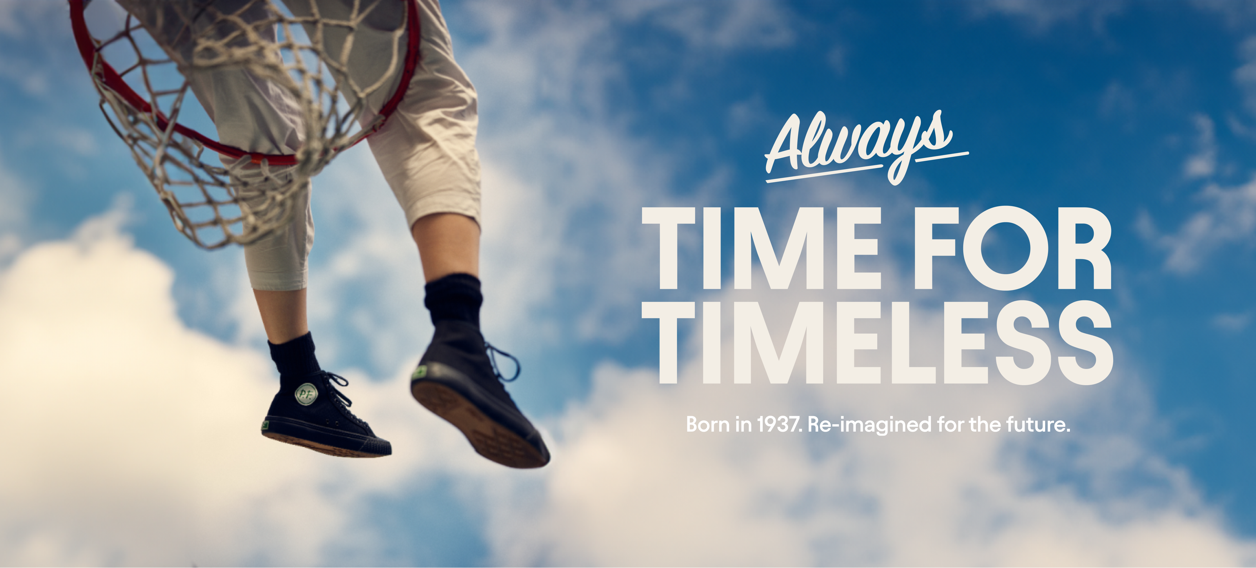
Encouraging a new generation to fly free.
REFUSING TO LET A LEGENDARY BRAND DIE
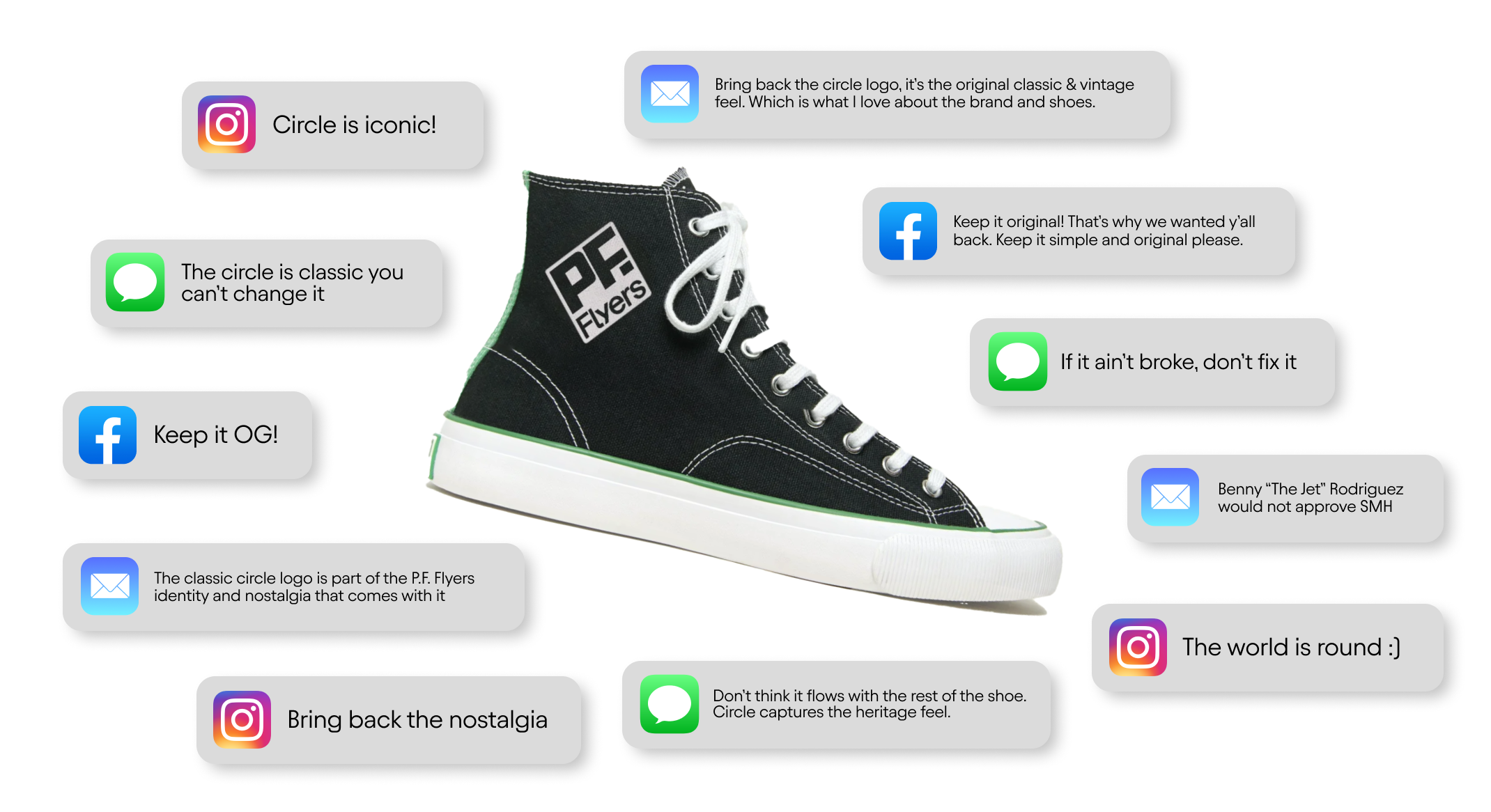
In 2021, P.F. Flyers reinvented itself as a fashion-forward “down with the patriarchy” challenger brand for Millennial and Gen Z women, and the market responded loud and clear: P.F. Flyers lost the plot. The brand became unrecognizable to its most loyal customers, and this hit the bottom line HARD. Speaking plain, without a sudden about-face, this American heritage brand circa 1937 would become an artifact of history.

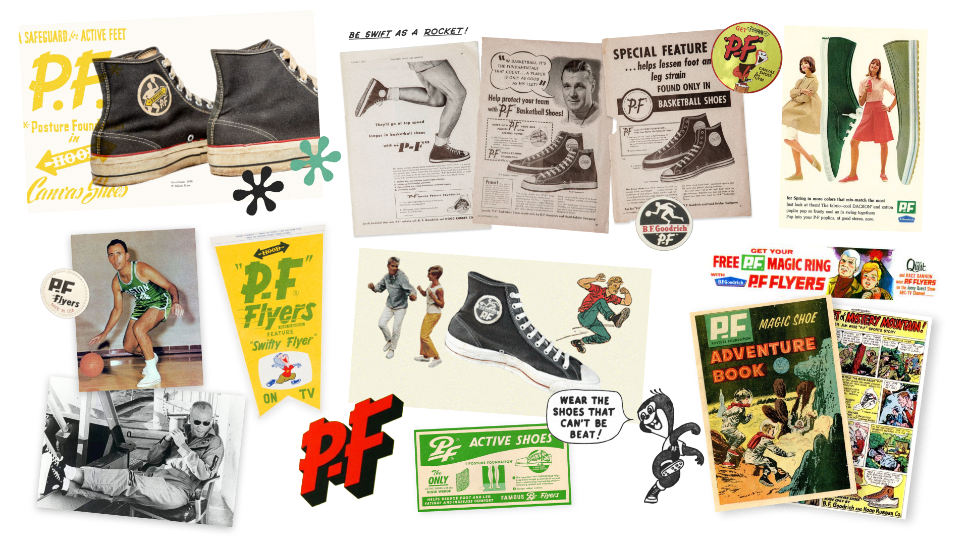
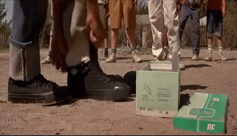
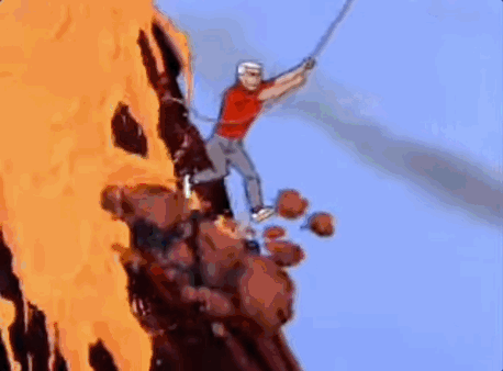
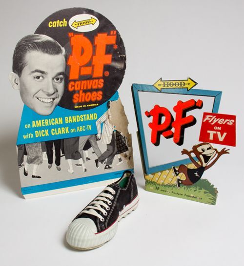
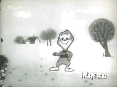
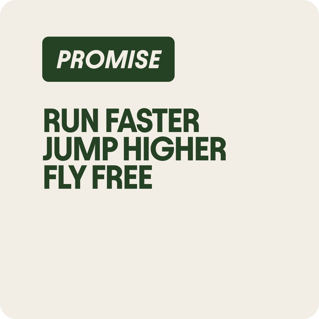
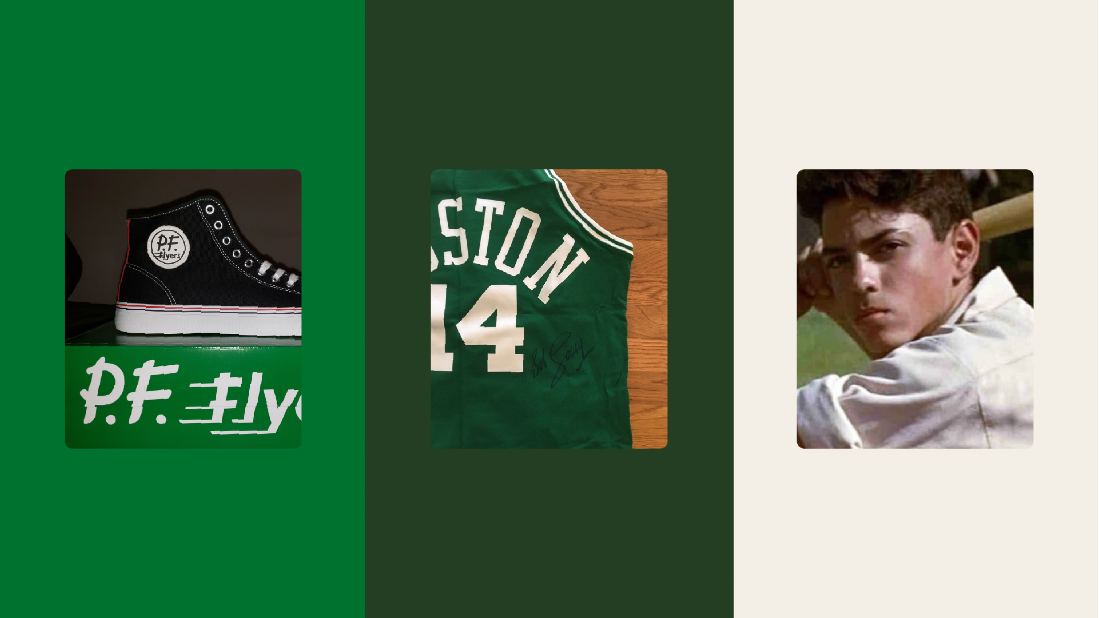
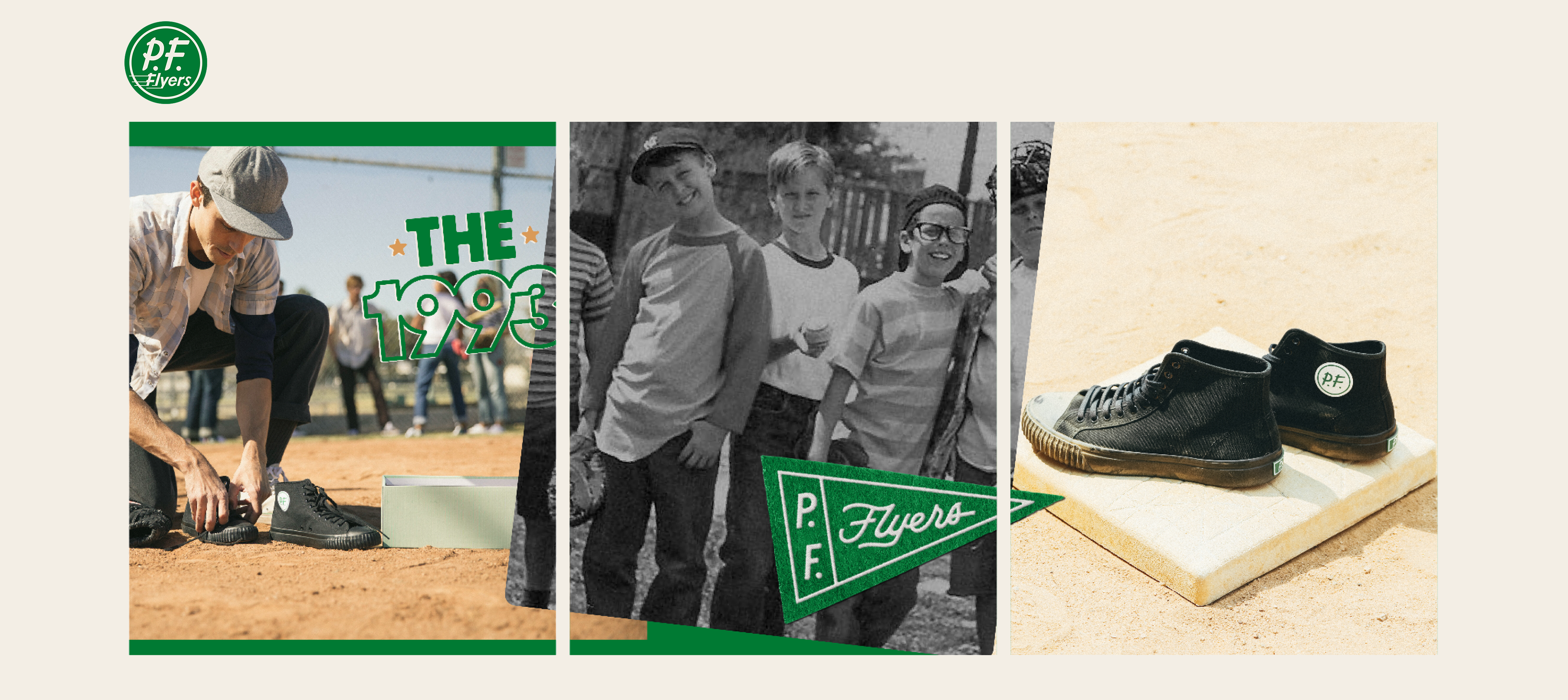
P.F. Flyers was one of America’s original sneaker brands. It was worn by GIs who won a world war. It was the first shoe company ever to endorse a professional athlete. It encouraged an entire generation to “run faster and jump higher” in the beloved 1993 film "The Sandlot."
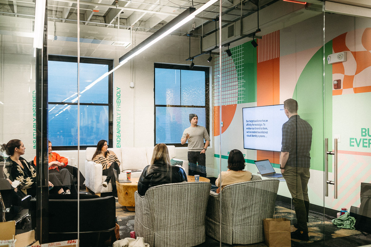
There was no shortage of nostalgia to tap into. To do so, we needed to understand what nostalgia meant to our target consumers: Millennials and Gen Z.
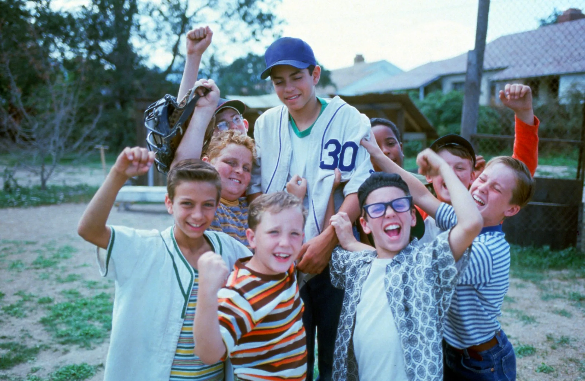
Millennial nostalgia for "The Sandlot" reflected a nostalgia for their childhood and the endearing all-for-one-and-one-for-all camaraderie that forms between a ragtag group of friends. Whereas Gen Z was nostalgic for an era they hadn't lived through and had no analogous experience with. They use stylistic preferences to express longing for a time before the internet—before the likes, filters, fake news, and doxing—which they perceive to be simpler and safer.
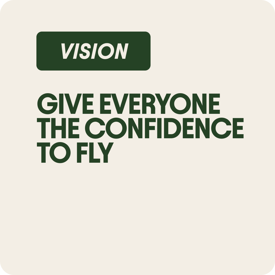
The common thread between both interpretations of nostalgia was: comfort, freedom, and fun. These were the sentiments worthy of building a brand around.


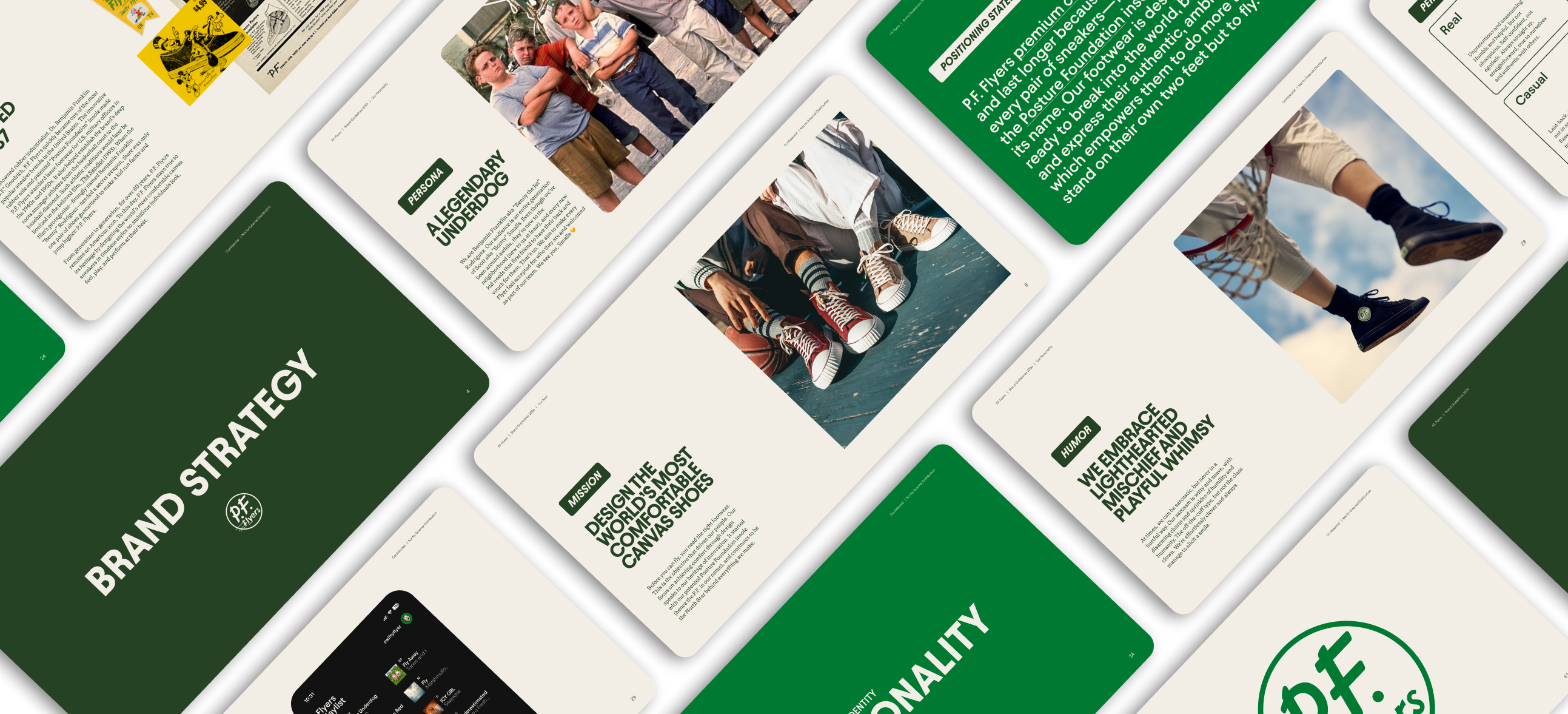
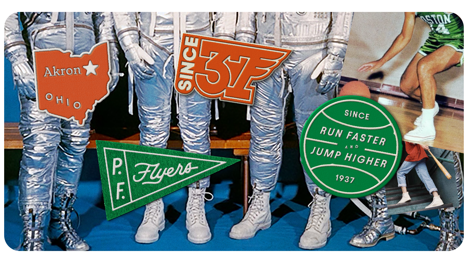
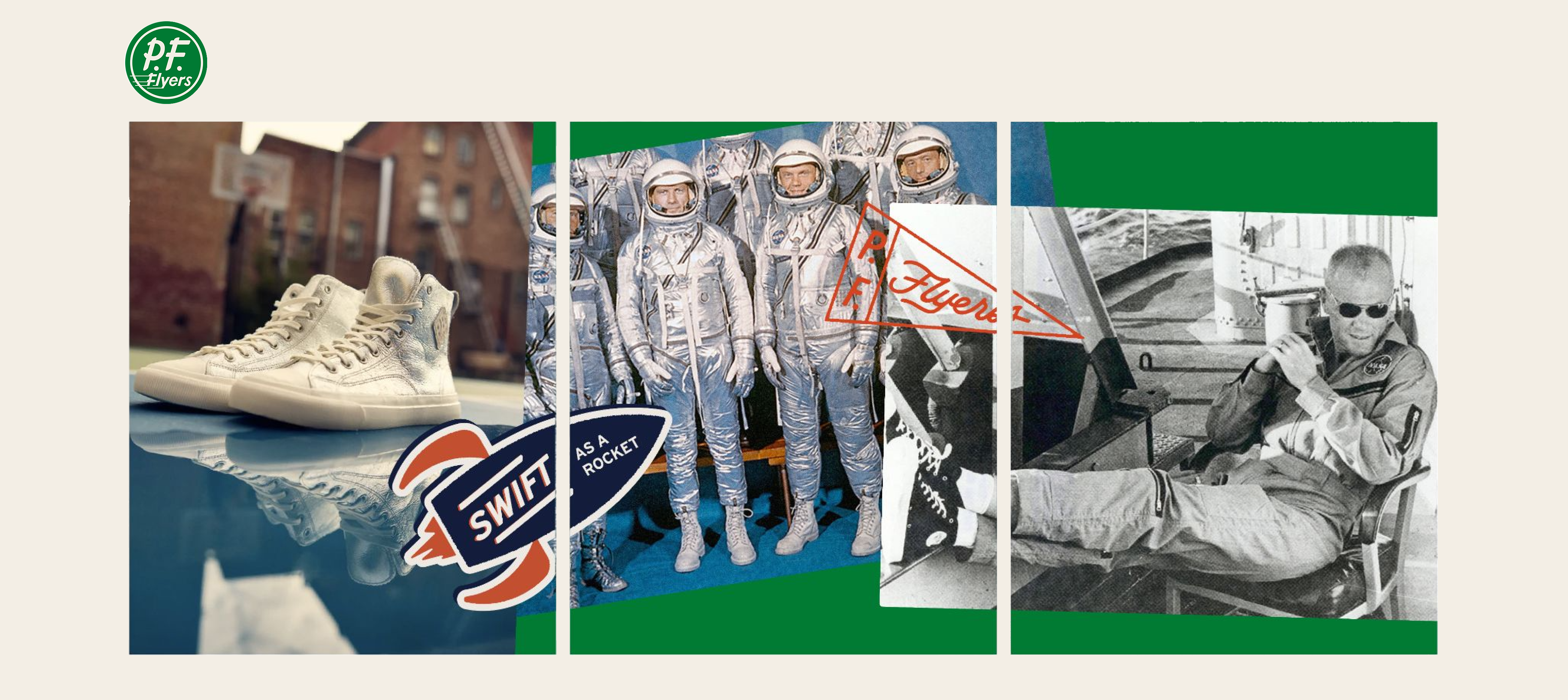
Refreshing P.F. Flyers' Visual Heritage
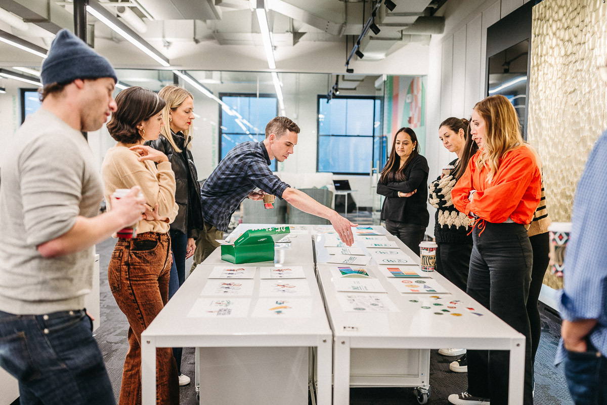
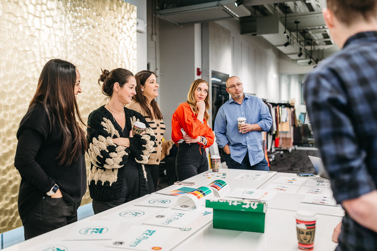
We delved into the heritage and our strategy with an immersive workshop at P.F. Flyers' headquarters in Boston. Armed with a bevy of printed materials, stickers, and embroidered patches, our goal was to foster open conversation and create a tactile experience that aligned our teams around one shared vision and fueled our creative process moving forward.
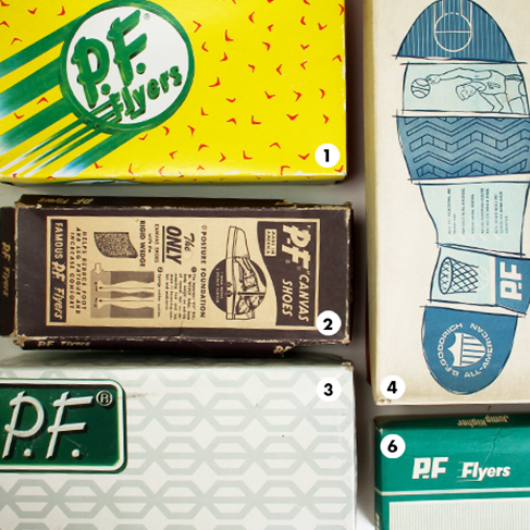
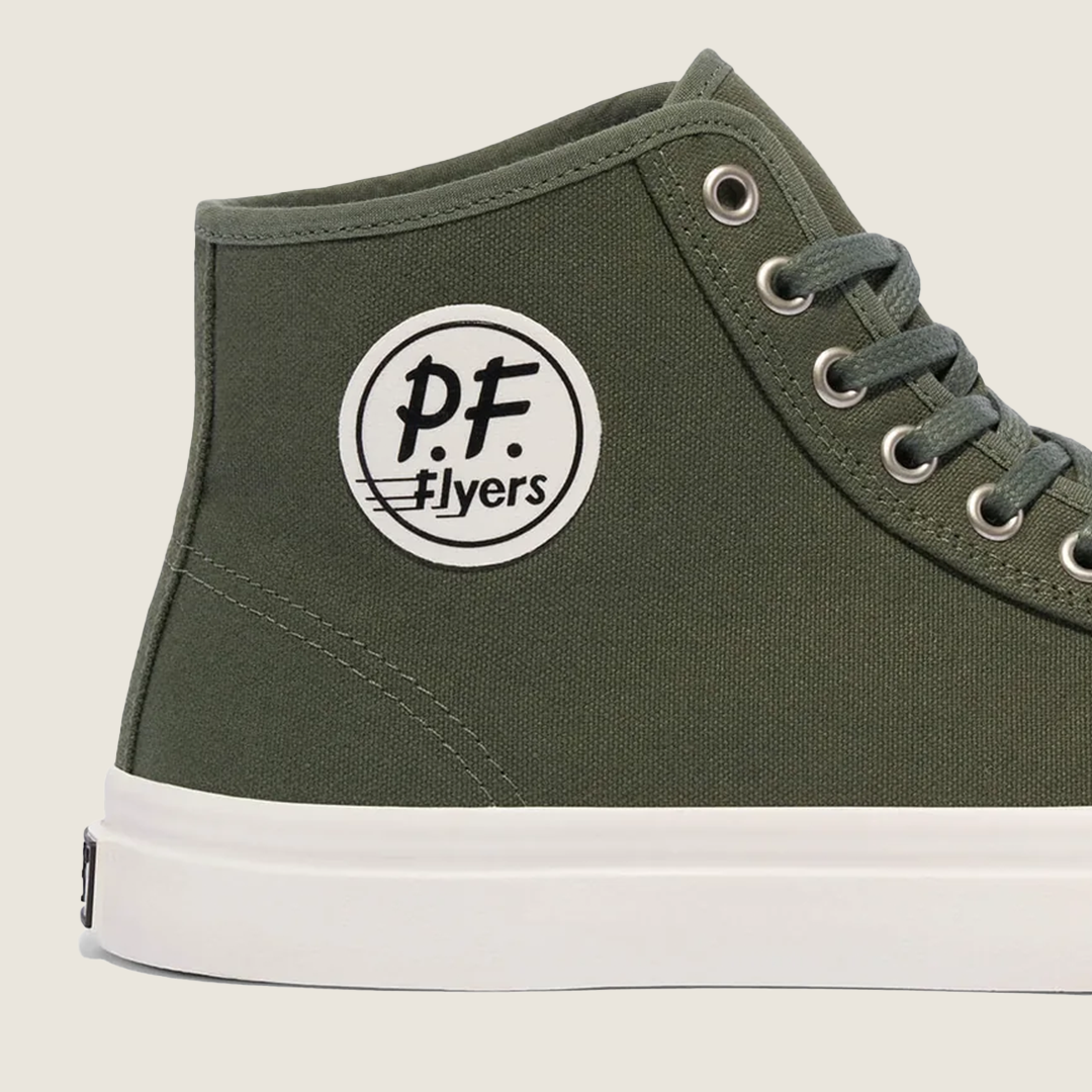
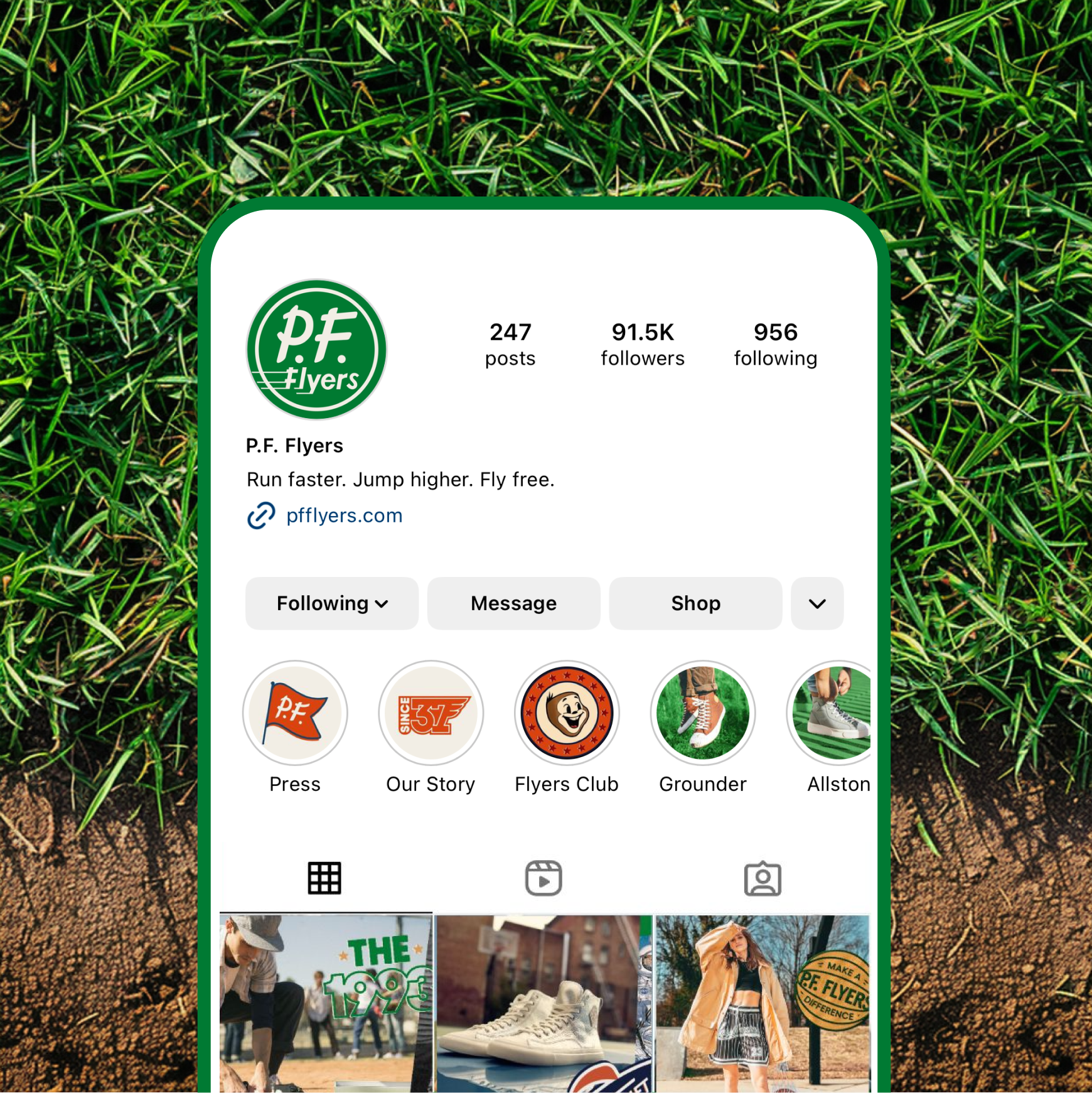
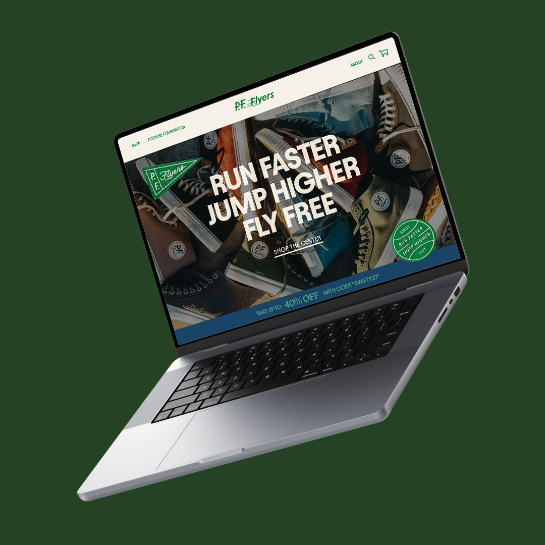
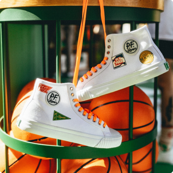
The new logo and wordmark are designed to pay direct homage to the iconic branding that defined P.F. Flyers for over a half-century. It exudes a character, trust, and familiarity that loyal fans would surely identify.

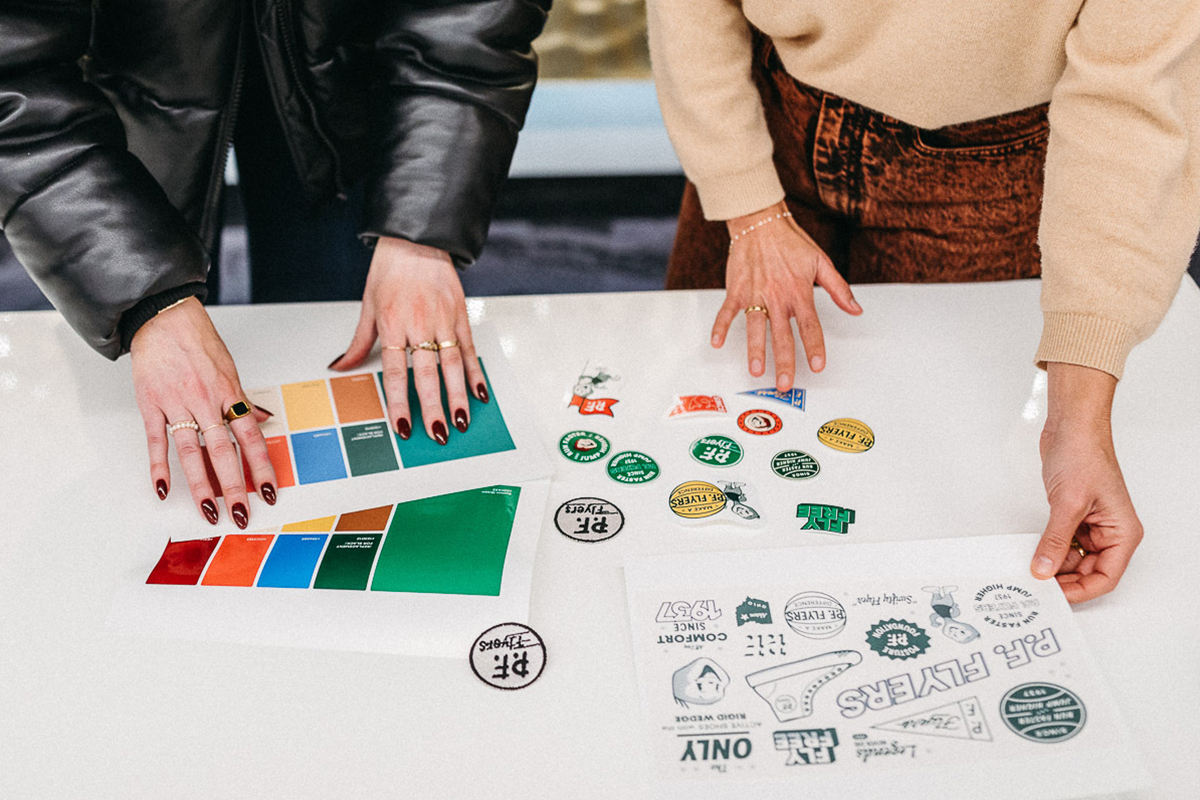
One of the most essential components of our brand is color. We opted for a more limited approach to the color palette by harnessing the most iconic tones of P.F. Flyers' past and committing ourselves to go (almost) all-in on green.

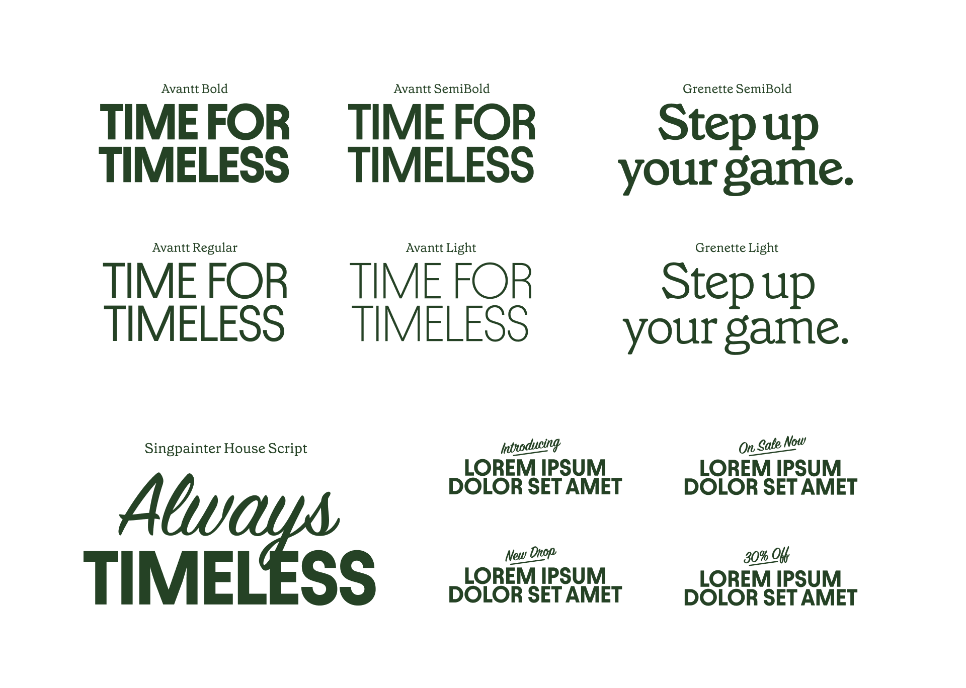
The typographic system is functional and expressive. It is straightforward, clear, and legible while also graphical and emotive. It serves as an extension of the brand's personality.

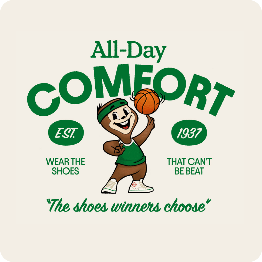
A library of pay tribute to P.F. Flyers’ mid-century origins. Their design is characterized by a style that leans more conservative with minimalist flair, simple lines, brushstrokes, and geometric influences. The result feels accessible, warm, and inviting. When paired with modern copy, our illustrations evoke a sense of comfort, stability, and virtue across digital, physical, and embroidered applications.

“It's a new day and it starts here. We are so thankful for the partnership throughout these last few months and appreciate all the care that went into this rebrand. We can't wait to get all of this out into the open!”— Lisa Bagaco-Lewis, CMO P.F. Flyers
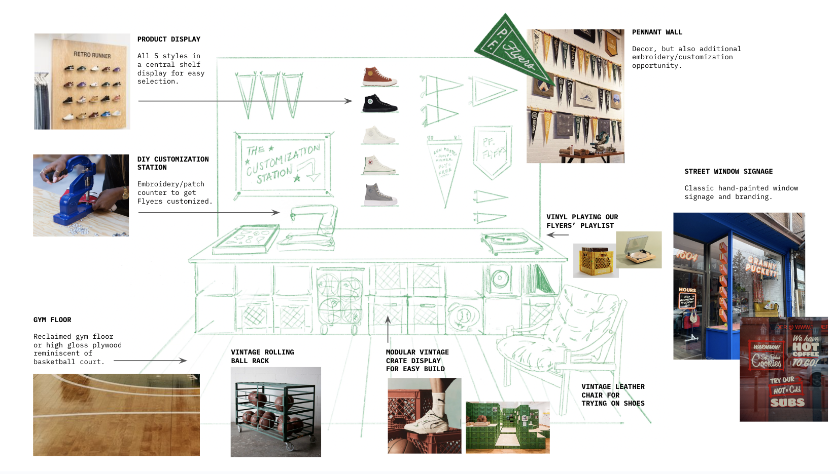
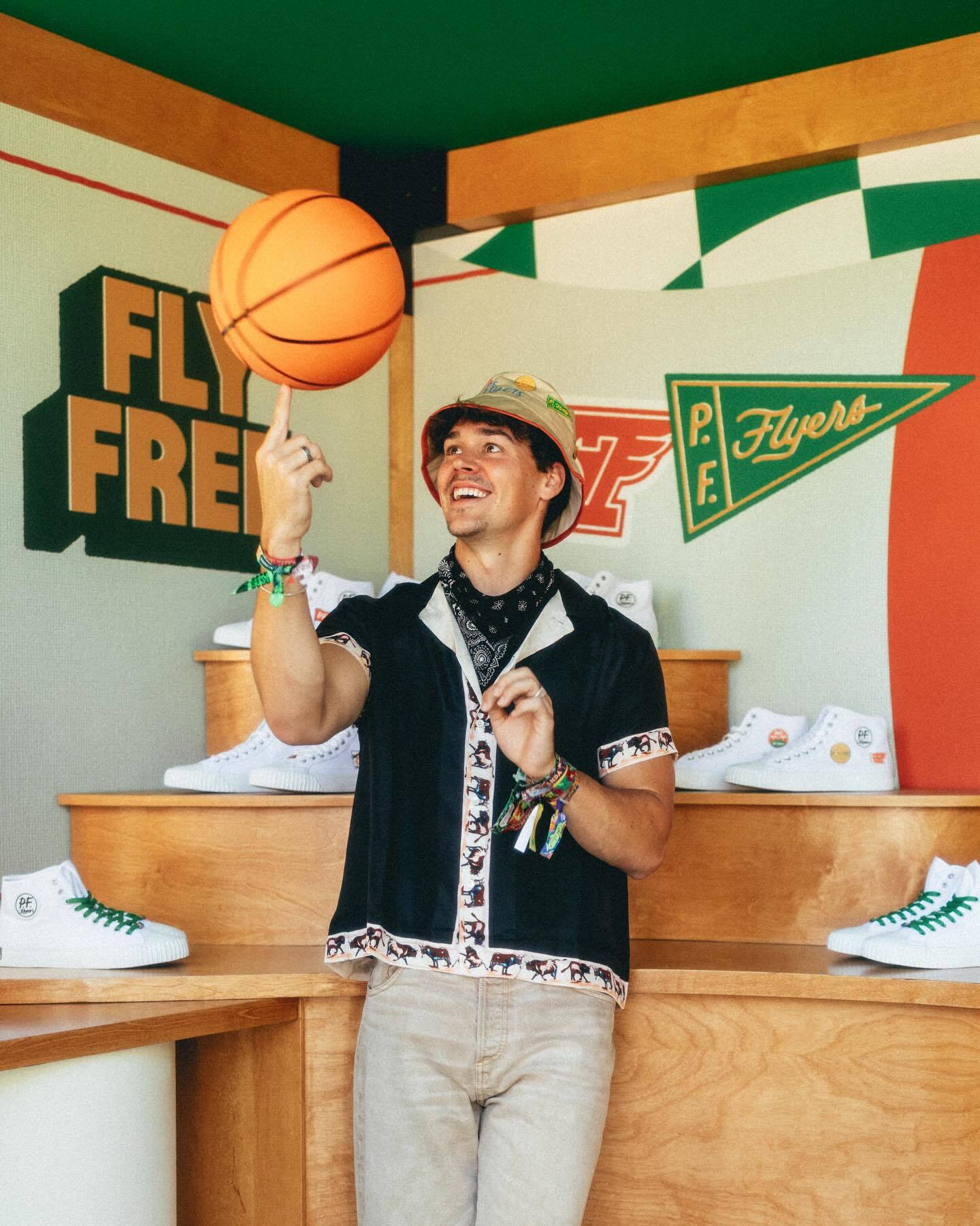
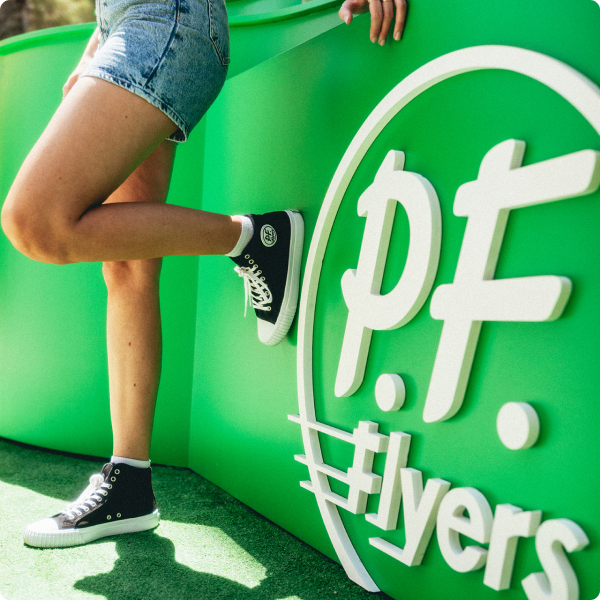
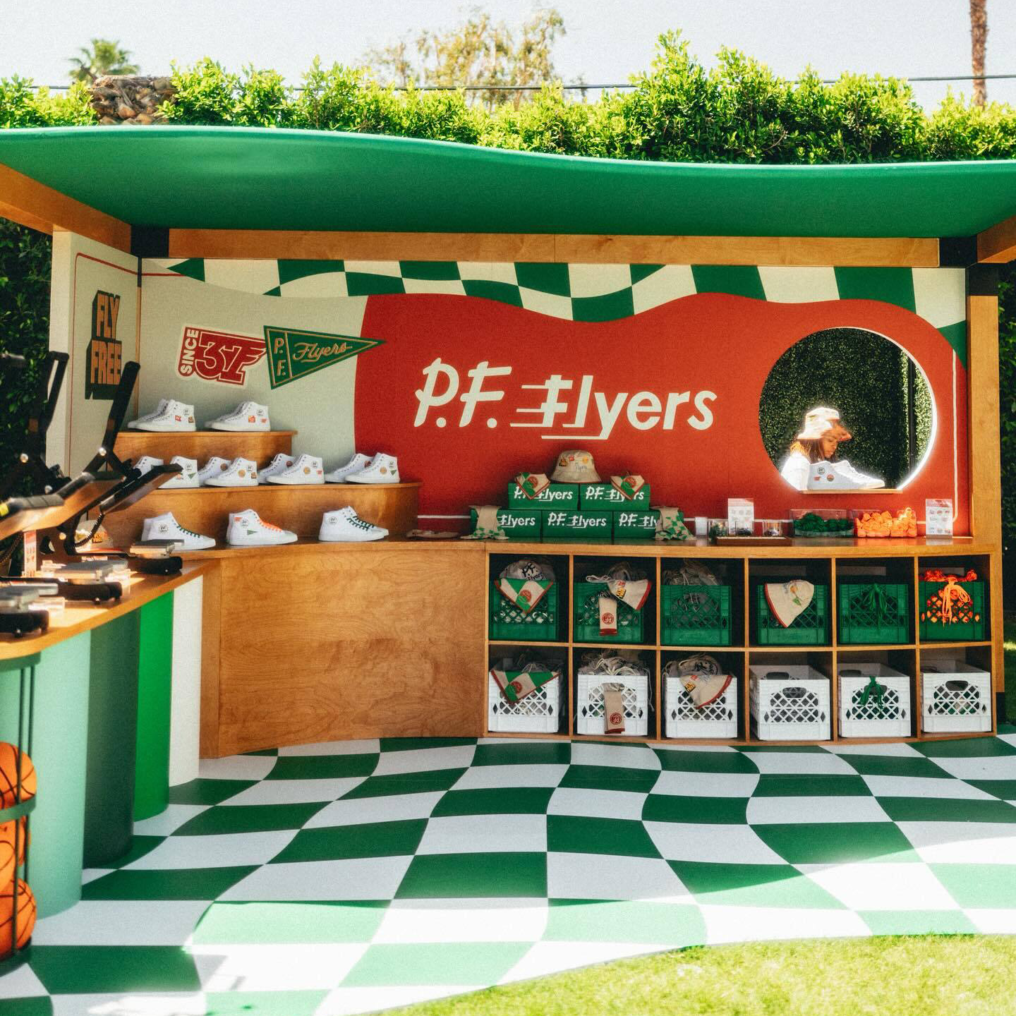
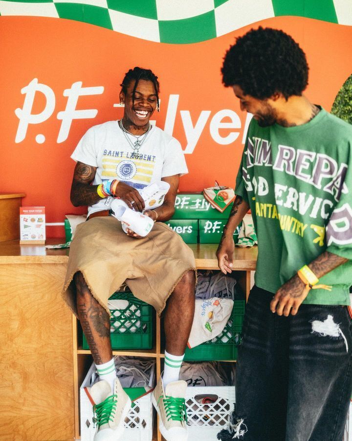
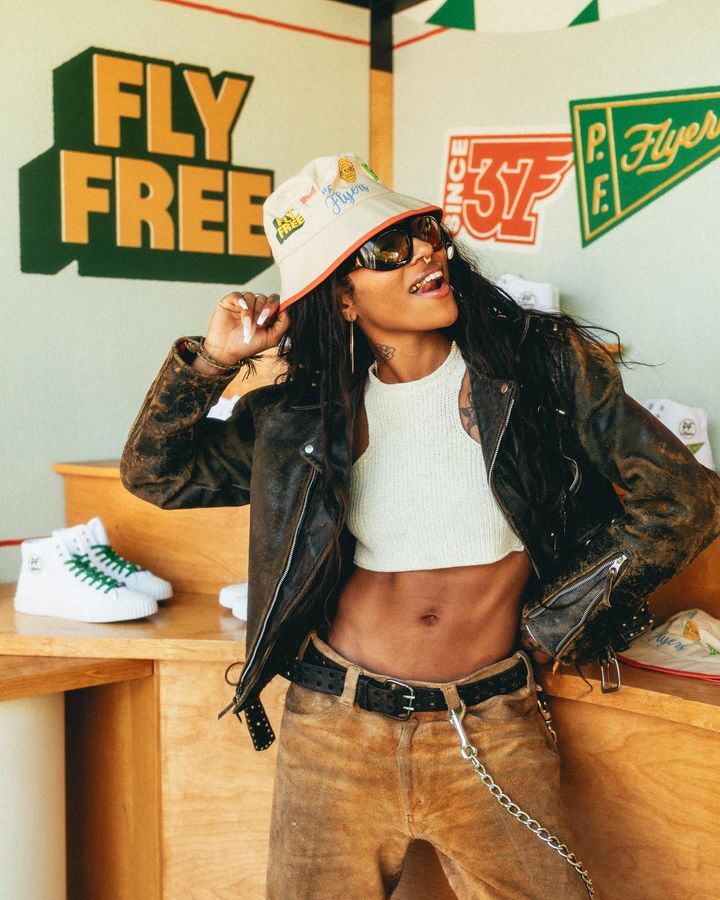
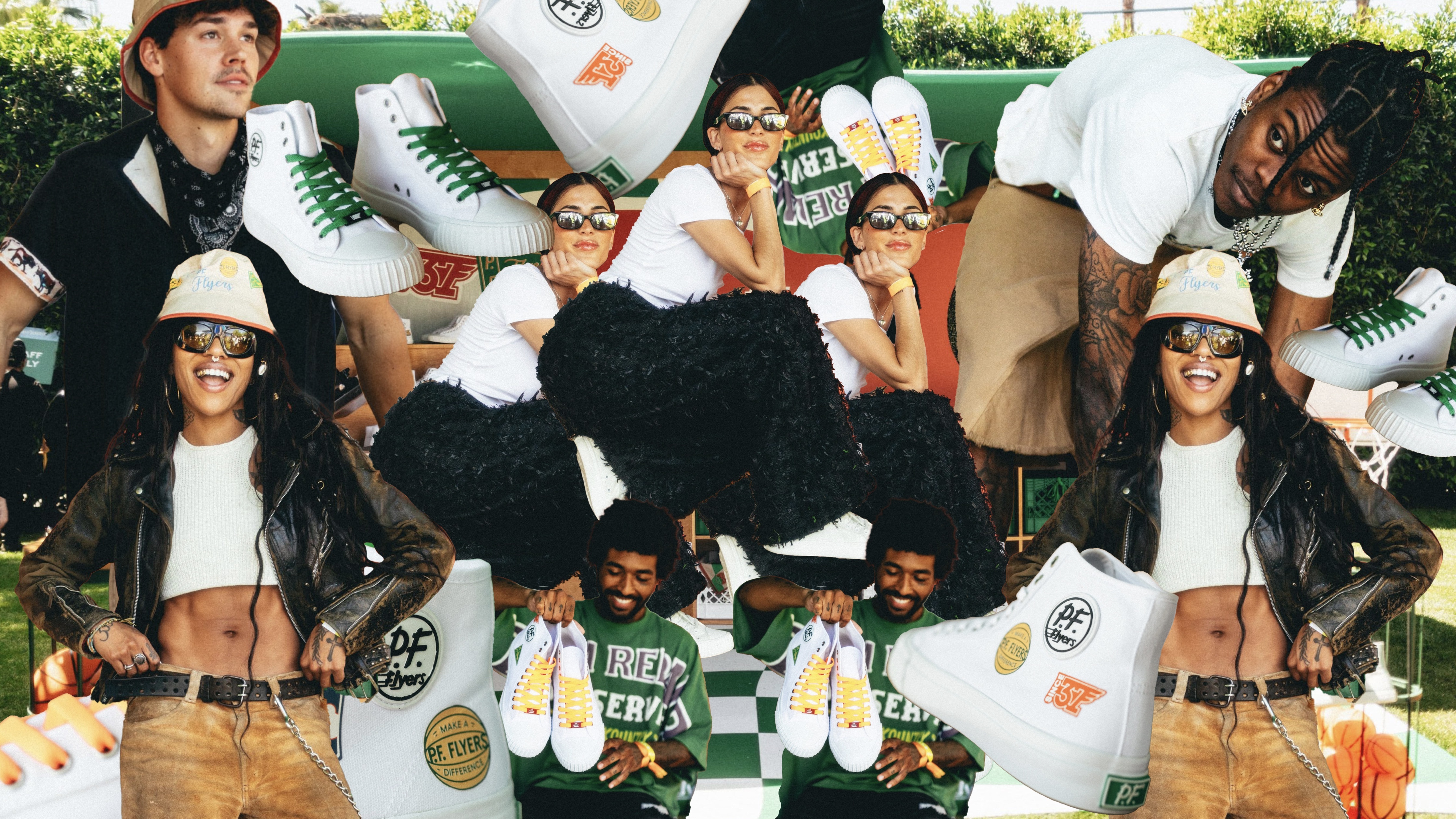
Experiential/Pop-up Activation
To the people who empowered us to fly free
Kassia Davis, Lisa Bagaco-Lewis, Caitlin Kaseumsouk (Bendiak), Mona Simmons, Carly Mask, Tim Praetzel, Anna McCaleb, Steph Smith, Charlie Smith, and all the Flyers